HEURISTIC EVALUATION F&B ACADEMY
HEURISTIC EVALUATION F&B ACADEMY
HEURISTIC EVALUATION F&B ACADEMY

Client: Cambusa, Antigua
Design tools: Sketch, Invision Studio, Photoshop
Client: Cambusa, Antigua
Design tools: Sketch, Invision Studio, Photoshop


Corporate Projects
Stanley Black & Decker 2021 - 2022

Summary
I have rejoined CribMaster in July 2021. Currently, we are working on rethinking and redesigning the entire mobile and desktop experience. In this project, I am focusing on mobile design and usability, while helping the organization creating a brand new style guide. The new software is aspecting to launch in 2024.

Style Guide, example 1
Transitioning from an E-com company like AutoZone to a software based organization was
not easy. The current CrbMaster software is substantially large, complex and fairly old. From
the beginning, understanding the 5 W's has been challenging, yet rewarding.

New Side Sheet, mobile example
When I rejoined the company, the project roadmap was already defined, the deliverables and the
dependencies identified, together with the business objectives; the project was broken down in
five different major modules.
As I mentioned, the first few weeks were quite challenging; not only has been difficult understanding
the complex Information Architecture of the product, but also I had to readjust to a completely
new design approach, so to speak.
During my work experience at AZ, I was spending a great deal of time understanding requirements, creating user personas and wireframes, analyzing competitors and gathering design ideas. I was
closely collaborating with researchers to define use cases while constantly presenting low to mid
fidelity mockups.

Style Guide, example 2

Pop - Up, View User Information, mobile
With CribMaster I am focusing more on creating hi - fidelity screens by closely collaborating with
backend developers and QA engineers; through an ongoing usability testing, I am learning how
to implement functionality while building a better user experience.

Style Guide, example 3
AM I THE RIGHT FIT?....
I always considered myself a UX generalist and, throughout my career, I have been intrigued by
different UX principles such as Interaction Design, Information Architecture, User Research,
Analytics, Ethnography and so forth. Now, only two weeks into my job, I am creating pixel perfect
hi - fidelity screens ready for testing and implementation. I am not going to lie; I was struggling.

New Dashboard, mobile example
UP FOR THE CHALLENGE
I believe that change is one of the few constants of life and it requires us to embrace uncertainty.
What I believed to be a bad career decision turned out to be one of the best professional experience.
As a designer, I have learned that change is sometimes needed; although it was hard in the beginning, I really believe that rejoining CribMaster equated to growth and new learnings.

Bottom Sheet, mobile example
WE REALLY MUST DECLUTTER
It is so challenging to convey so many information in a small screen device; I must constantly
think about usability while trying to design a product that is also desirable.
In a software so old and large, the focus was to simplify things as much as possible and to get
rid of anything that wasn’t providing something useful, meaningful and valuable; just like I have
learned on the books... "simplification improves clarity and reduces anxiety".

Dialogue, mobile example
First thing first, we wanted to have only one primary CTA on each screen to provided the users
with a clear sense of what they can aspect from that particular screen, and led them in the right
direction. We introduced bottom sheets, dialogues, pop - ups, cards, drop - downs, tool tips, tabs
and modals
Although I am always open to find inspiration from different creative platforms, I have been
designing all of the new components following Google Material Design.

CTA Add Crib, mobile example
We really strived for simple navigation; the focus was to minimize the total number of navigation
options and to minimize the level of friction by allowing our users to complete the task at hand
as quickly as possible.

Form Fields, mobile example 1
We wanted our users to spend a very limited amount of time typing. We kept our forms as precise
as possible, used inline validation and Auto - fill feature to fetch previously entered information
and ditched anything irrelevant contained in the old software; in a product so large, clearly
communicating the current location was also one of our main focus.

Form Fields, mobile example 2
I have learned the importance of introducing good padding between interacting elements and how
to design finger friendly touch targets. My direct manager taught me so much about legibility and
readability and how to choose typefaces that work well in multiple sizes and weights or waht to
avoid when it comes to color and contrast.
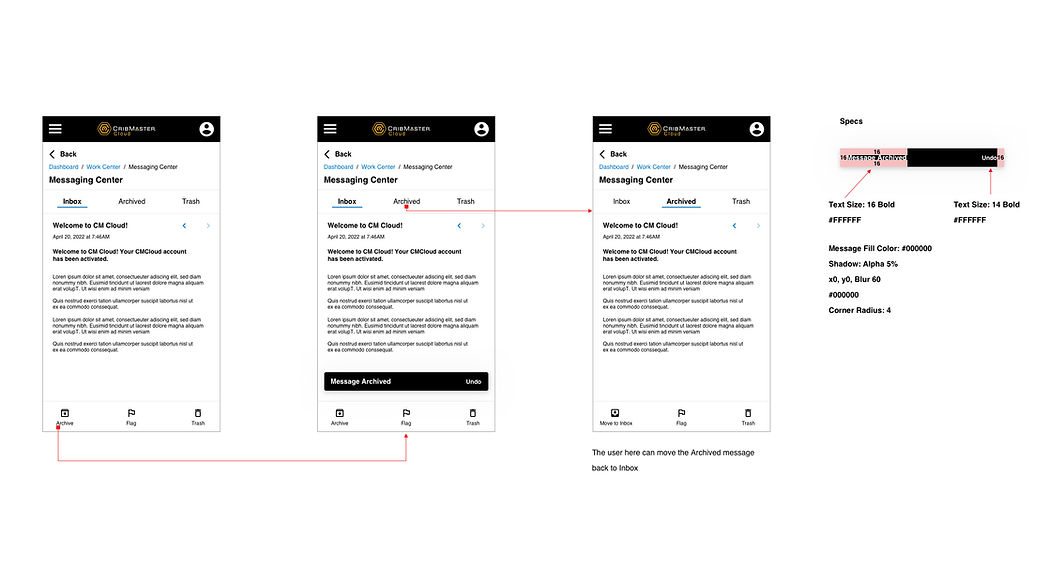
Messaging Center, mobile example
WHAT I HAVE LEARNED
Among other things, I have learned that designing for mobile is so unique, challenging and
rewarding. You must constantly think about the context of use and understand that user behaviors
are constantly changing. You must try to present the right amount of content at the right time;
you must always keep in mind those "fat fingers" - touch targets, and not be afraid when
presenting you ideas and recommendations; especially when you're designing for small screens.